--edit-- Since I read about the central limit theorem in a deeper fashion after publishing I have realized that the bell curve is not demanded by statistical laws. This is because exam results are strongly influenced by factors like the amount of effort students put in. The bell curve is still desirable since it allows us to evenly distribute people. -- edit --
Exactly how good is our education system? Touted to be a very good one and supported by a few shining gems, what exactly does the data say about the education system?
During the course of this article you will find some pleasant but unexpected things and some expected ones. About the absolutely shocking I cannot make a promise.
First up is my home state Rajasthan. The Rajasthan Board of Secondary Education has been put under the microscope. The choice was simple, this examination board did not ask for anything other than a roll number to get the results of students. Fair enough. I obliged and wrote a Python script to automatically get as many results as possible. After about 30,000 records my Internet connection was ready to die, and so I stopped mining for more results for the day.
While I was processing the results of my mining, I realized that the results of the CBSE class 12 board examinations were declared. With wild glee I prayed that they too ask for nothing more than a roll number. My prayers were granted. After tinkering with the python script a little it was good to go for the CBSE website. Again I put my computer to use and started mining. After about 50,000 results my Internet connection became really slow and computer became really hot. That got my attention and I stopped mining.
Now for the data analysis part. What should I do to this data? A simple answer was to check if it was following the normal curve. What is normal curve you say? Well normal data in simple words is as follows:-
This is the plot for the Rajasthan Board results. The sample size was 30,000 students. Marks obtained vs frequency.

There are some interesting things about this plot though.
A spike like that indicates that the system is inherently rigged to provide most students with marks around 60. This is extremely fishy. What is the significance of this number? It is not the fail barrier. Examiners pushing people over the failing marks might have explained such a thing.
This is a skyscraper right in the middle of our marking scheme. One explanation may be that this is some grade demarcation. (this is not confirmed)
Another explanation may be that the sample size was too small. This is less likely as 30k samples for an entire state are enough in my opinion.
We will talk of this later as I have a conspiracy theory to cook. As soon as the CBSE sample size is noteworthy (arround 1 lakh students) I will plot it's histogram and update this article. Stay tuned.
-- Update -- 1
It seems someone already did this on Quora for ICSE. Will continue to do for CBSE and pray I have enough data before he does.
Then again I might be rambling, and my sample size is definitely small. (Maybe someone with more experience in stats can help?) The Internet connection is simply too slow to support such high usage of services.
Until there is someone willing to support this study, this is the best I can manage.
So go ahead and have a look at the graphs and enjoy. There were some subjects I did not know existed( no really, I swear).


During the course of this article you will find some pleasant but unexpected things and some expected ones. About the absolutely shocking I cannot make a promise.
First up is my home state Rajasthan. The Rajasthan Board of Secondary Education has been put under the microscope. The choice was simple, this examination board did not ask for anything other than a roll number to get the results of students. Fair enough. I obliged and wrote a Python script to automatically get as many results as possible. After about 30,000 records my Internet connection was ready to die, and so I stopped mining for more results for the day.
While I was processing the results of my mining, I realized that the results of the CBSE class 12 board examinations were declared. With wild glee I prayed that they too ask for nothing more than a roll number. My prayers were granted. After tinkering with the python script a little it was good to go for the CBSE website. Again I put my computer to use and started mining. After about 50,000 results my Internet connection became really slow and computer became really hot. That got my attention and I stopped mining.
Now for the data analysis part. What should I do to this data? A simple answer was to check if it was following the normal curve. What is normal curve you say? Well normal data in simple words is as follows:-
In any population, if you count the frequency of any trait, you will observe a bell like curveNow this is a very powerful prediction with roots in solid mathematics. Any deviation from this rule implies a bias in the real world where the data was generated. With this in mind I obtained a histogram.
This is the plot for the Rajasthan Board results. The sample size was 30,000 students. Marks obtained vs frequency.

For simplicity all students who failed were simply not plotted to let us concentrate on those who have passed.
As expected, a bell curve is observed. There are spikes at regular intervals but they can be explained by assuming that examiners will tend to give 30.5 instead of 30.49 and so on. This is excusable.
- The peak of the bell is not at 50 as expected but at approx 54. This is indicative of a system which inherently passes students who appear for the paper.
- The slope for the left is steeper for the one on the right. Fewer students seem to be scoring less than the average.
- It is HUGE! It is higher than the peak of the curve.
- It is ahead of the curve peak.
- There is no other peak like it.
A spike like that indicates that the system is inherently rigged to provide most students with marks around 60. This is extremely fishy. What is the significance of this number? It is not the fail barrier. Examiners pushing people over the failing marks might have explained such a thing.
This is a skyscraper right in the middle of our marking scheme. One explanation may be that this is some grade demarcation. (this is not confirmed)
Another explanation may be that the sample size was too small. This is less likely as 30k samples for an entire state are enough in my opinion.
We will talk of this later as I have a conspiracy theory to cook. As soon as the CBSE sample size is noteworthy (arround 1 lakh students) I will plot it's histogram and update this article. Stay tuned.
-- Update -- 1
It seems someone already did this on Quora for ICSE. Will continue to do for CBSE and pray I have enough data before he does.
-- Update -- 2
After a grueling evening consisting of snail paced mining of results, I turn to Twisted and asyncio. With that I rewrite the code again and behold, the program is faster than The Flash. After a while I get bored and cannot wait to see the plots so I stop. End result, 42294 usable student records obtained.
Maybe someone with more time and better resources can conduct a better analysis.
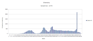
There is plenty of data now and I have plotted the results. They are at best troubling. Have a look. The data is available here.
Some subjects have a low sample size and you should keep that in mind while looking at the graphs. Some however have a large sample size and still show some very "creative trends".
Things to note:
After a grueling evening consisting of snail paced mining of results, I turn to Twisted and asyncio. With that I rewrite the code again and behold, the program is faster than The Flash. After a while I get bored and cannot wait to see the plots so I stop. End result, 42294 usable student records obtained.
Maybe someone with more time and better resources can conduct a better analysis.
There is plenty of data now and I have plotted the results. They are at best troubling. Have a look. The data is available here.
Some subjects have a low sample size and you should keep that in mind while looking at the graphs. Some however have a large sample size and still show some very "creative trends".
Things to note:
- CBSE seems to have the policy, "When in doubt give 95"
- The overall trend is to pass students.
I believe that examinations are a means of distributing students across marks in order to make it easier to judge them.
100 is considered good only because a small number of students should be able to get it.
In such a model a bell curve is the best things that could happen. This curve makes us realize that a lot of people are just average. The best and worst are rare cases. To evaluate a person you ask their marks and can judge how many such people are about.
All of this goes out of the window if the normal distribution is removed from the picture. You no longer have any idea of how good the student is. All you know is that they have obtained such and such marks. The marks themselves have no meaning.All that is left is an empty number.
The current battle of high cutoffs in colleges is entirely due to the non normal distribution of marks if this data is to be believed. Since everyone is in the 95 bracket, the cutoff needs to be higher. A normal distribution ensures that everyone is judged properly and cutoff are reasonable.
Then again I might be rambling, and my sample size is definitely small. (Maybe someone with more experience in stats can help?) The Internet connection is simply too slow to support such high usage of services.
Until there is someone willing to support this study, this is the best I can manage.
So go ahead and have a look at the graphs and enjoy. There were some subjects I did not know existed( no really, I swear).


No comments:
Post a Comment